I’ve learned a lot about challenging what I know this semester, experimenting with the principles through unconventional (unconventional to me) means. I’m happy with how far I’ve come and I’m keen to continue moving on this path of experimentation in my design.
also here’s a video of me when I was 18 studying art.
Use all the knowledge acquired during the previous assignments and sessions.
The poster has to speak of yourself, but through a text that represents you: can be a text from your favourite author, (the lyrics of) a song from an artist you like, a dialog from a movie or theatre play. You may choose to use a part but it needs to have at least three sentences.
Explore hierarchy using the content and use the structure of a grid relating the elements.
You can choose to write it in a language other than English, but in that case, you have to provide a translation, can be a small text somewhere in your composition.
With the poster you will hand-in a text explaining why you chose that text, who is/are the author/s and date if you have it. Explain as well
what you meant to represent with your design,
what typography you have chosen and
reasons for the choices of type you have made
font designer and date
Checklist:
Poster Format A4 PDF + Text explaining your choices
Include in the composition the author/s of the text or references
Use only typography. Be wise in your choice of font, avoid decorative or script fonts if possible
Use what you have learnt from type mixing
You may use colour
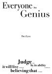
Everyone is genius
Including Einstein
I’m pretty happy with how this poster turned out. I could have arranged the text better, given more room around the sides perhaps.
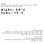
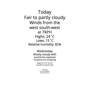
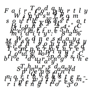
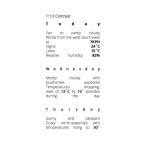
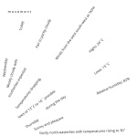
For this week‘s assignment you recover all the freedom and you can work with any size any typeface any principle combination and create 3 versions of the weather report.
One of these versions should be legible, the others can be experimental.
Create a layout of the weather forecast in one 400px square canvas. Use only the text supplied. Don‘t apply any distortions to the typography!
Lay out three completely different weather reports using any font and selected oneor combineany of the 6 principles of design:
any size, two typefaces, three styles, three principles
Create a layout of the weather forecast in one 400px square canvas. Use only the text supplied.
Lay out six completely different weather reports using any font size with Open Sans, Open Sans Bold, Open Sans Italic,Georgia, Georgia Bold and Georgia Italic with the 6 principles of design:
scale
balance
contrast
emphasis
movement
pattern
I’ve been experimenting well, especially this week, I’m stoked with how they all turned out.
These past few weeks have been interesting, Getting the hang of the experimentation side of design, taking the text of a weather forecast and utilising it to show principles of design.
T04
The first 2 were from the first assignment, I didn’t have a clue what I was doing, My design is ok but I missed the point of the exercise completely.
For the next weeks you have to create a layout of the weather forecast in one 400px square canvas. Use only the text supplied.
Create a cover page. This week you can work using any size, weight or style of typeface.
Do not repeat the text
Type always has to be black
Don‘t use any distortion
Don‘t use any effects: strikethrough, dropshadow, etc
Don‘t hyphenate the text or cut characters off by the side
T05
The next weeks I start to get the idea but really very little experimentation going on.
Create a layout of the weather forecast in one 400px square canvas. Use only the text supplied.
Create a cover page. This week you have to work in three different layouts, one for each design principle, and using as typeface «Open Sans regular 10 pt» and with 3 principles of design:
scale
balance
contrast
T06
Then I really start to experiment, they don’t necessarily look all that great but they do show what I’m trying to get across. I’ve definitely come a long way in a short time with my ideating.
Create a layout of the weather forecast in one 400px square canvas. Use only the text supplied.
Lay out three completely different weather reports using only Open Sans 10 point and Open Sans Bold 10 point with 3 principles of design:
Watch this on your netflix set to America, it’s a totally rad documentary about the bones brigade; Stacey Peralta’s skate team. These guys gave birth to a new genre of design by defying the norm, in skating and in life.